karenmaria
A soft, ethereal design system for a wellness brand that had no identity yet, built from three colours and four reference sites.
Design system · Brand identity · Web · Wellness · 2026
- client
- KarenMariaGlobal, a lifestyle and wellness brand
- role
- Solo, end to end
the problem
KarenMariaGlobal had no visual identity: no logo, no site system, no brand assets. What I had was three colours the client wanted (a saturated pink, a deep forest green and a soft blush) and four sites whose feel she liked. The job was to turn that into a system she could build and grow on, without it becoming a copy of any one reference or a generic “wellness template”.
The inputs: a coaching site, a floral studio, a social agency and a bodywork studio as references, the three seed colours, and the direction “airy, elegant, soft motion, a strong sense of flow”.
the process
Looked for patterns, not looks
I lined up the four references and only kept what most of them shared: wave and scallop dividers, portrait photos with an arched top, tracked uppercase serif headlines, pill buttons, flat colour blocks instead of gradients, and narrow text columns. Copying any single site would have given her someone else's brand. The shared patterns described a genre she could own.
Grew three colours into ramps with jobs
Each seed became a 50–900 ramp (pink, green), plus warm cream and stone neutrals mixed toward the seeds so they don't read cool grey. On top of the ramps sits a semantic layer (
--surface-card,--text-primary,--accent-deep) so components never reference a raw hex. One rule held throughout: no more than two accent colours visible at once, because the pink is loud enough to take over any section it shares.Gave each typeface one role
Prata handles tracked display headlines, Cormorant Garamond italic handles softer editorial lines, Jost Light handles body and UI, and Caveat is kept for rare signature asides like “Hello, I'm Karen.” Keeping the script to one role stops it turning twee. All four come from Google Fonts because no brand fonts existed.
Set rules for motion, depth and shape
There's one easing curve (
--ease-flow, a gentle ease-out) at 320–560ms, with no bounce, to match “soft motion”. Hover deepens a colour instead of lightening it, and press scales to 0.97×. Shadows use warm brown rgba, not grey. Radii are 16–28px on cards, full pill on buttons, and an arched top on portraits.Wrote the voice
Warm first person, never corporate “we”. CTAs are uppercase, tracked and gentle (“Work With Me”, not “Buy Now”). Short poetic fragments are paired with longer reflective paragraphs, and there's no emoji. The references relied on typographic ornament instead of icons, so the copy rules do some of that work.
Built 14 components on the tokens
Button, IconButton, Card, Badge, Tag, Input, Select, Checkbox, Radio, Switch, Dialog, Toast, Tooltip and Tabs, in plain React, reading CSS variables with no hard-coded values. That way a later token change carries everywhere.
Checked it on a full marketing site
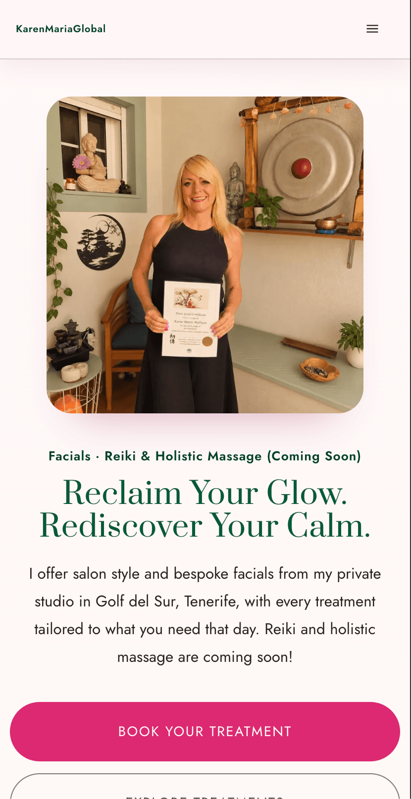
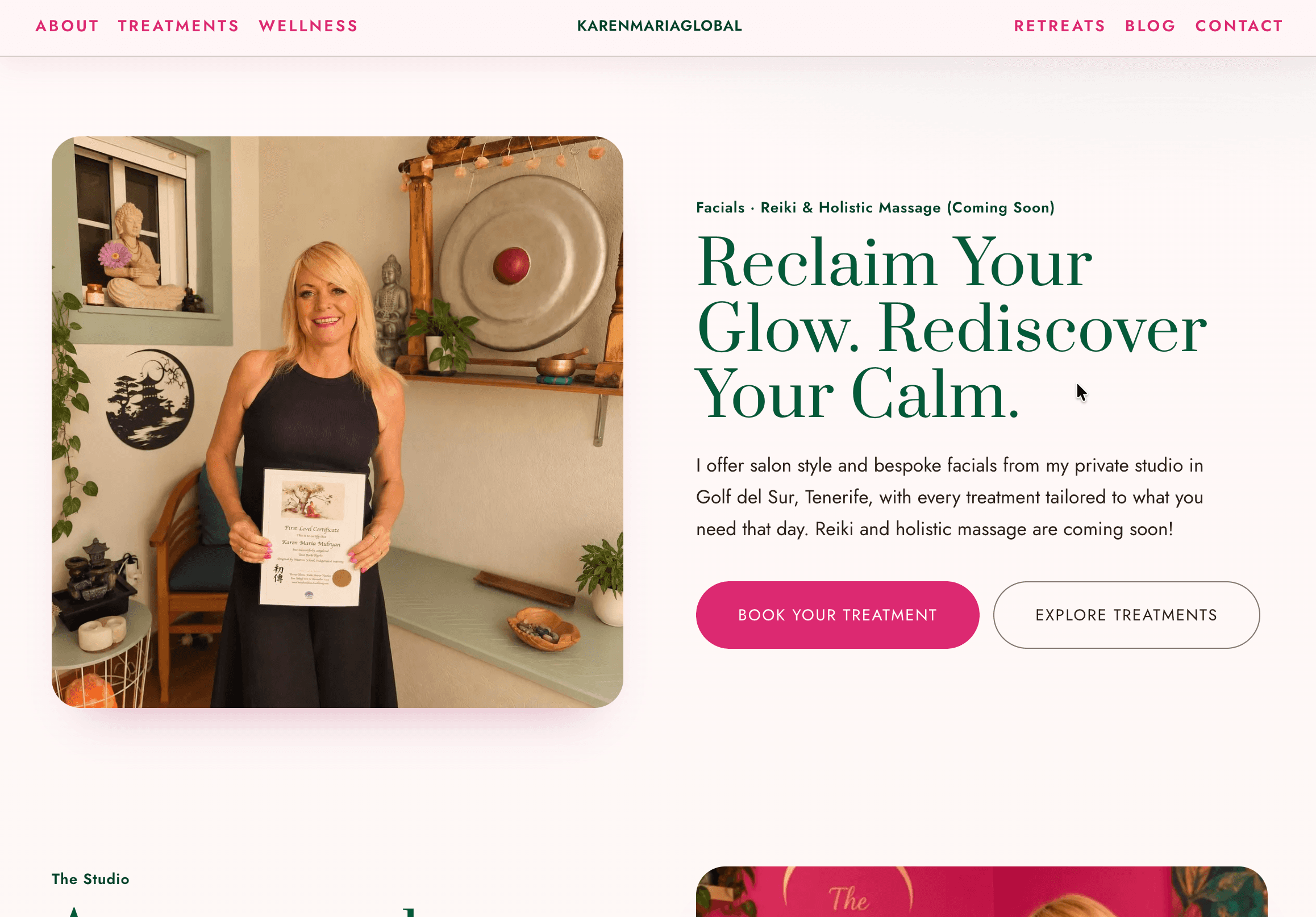
Header, Hero, About, Services, Testimonial and Footer are built only from system parts. Any page that needed a one-off style pointed to a gap in the system.
Documented it for humans and agents
A readme records content rules, visual foundations, iconography and caveats. There are 16 specimen cards, and a
SKILL.mdlets AI tools design on-brand with it.
identity snapshot
The block below uses KarenMariaGlobal's own palette and type, so you can see the system as it ships.
Pink 500
#DC2871 · seed
Green 600
#035A39 · seed
Blush / Pink 100
#F8E8F0 · seed
Cream 50
#FBF5F0 · page
Ink 900
#2B221D · text
Unearth contentment
“I want you to leave feeling like yourself again, just calmer.”
I created KarenMariaGlobal as a space where you can slow down, take a breath and make time for yourself. My approach brings together skincare, Reiki and holistic massage, with every treatment tailored to how you are feeling on the day.
Hello, I'm Karen
tokens: base → semantic
/* base */
--pink-500: #dc2871;
--green-600: #035a39;
--cream-0: #fffdfb;
--ink-900: #2b221d;

/* semantic */
--accent-primary: var(--pink-500);
--surface-deep:   var(--green-600);
--surface-card:   var(--cream-0);
--text-primary:   var(--ink-900);
components
how AI was used
- AI: Claude plugins generated the SEO and blog content, grounded in references I supplied. Claude also helped scaffold the token files and components.
- Me: I gathered and chose the reference sites, picked out the shared patterns, set the ramp and semantic token structure, chose the type pairing and gave each face a role, wrote the motion and restraint rules, and decided what to leave out: no gradients, no emoji, no invented logo, no invented icons (Lucide is flagged as a substitute).
where it is now
The system is live on karenmariaglobal.com.